England and Wales See Seventh Consecutive Week of Negative Excess Deaths
The ONS announced today that there were 9,941 deaths in England and Wales in the week ending April 23rd, which is 497 fewer than the previous week. In addition, this week’s number is 5% below the five-year average, and marks the seventh consecutive week of “negative excess deaths”. Here’s the chart from the ONS:
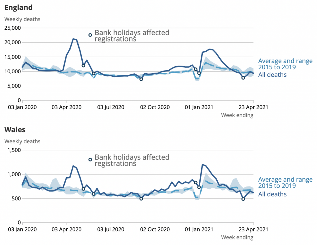
Over the last seven weeks of ONS reports, there were 5,511 fewer deaths than you’d expect based on the average of the last five years. And recall that, because the population is ageing, the five-year average slightly understates the expected number of deaths. So the true level of “negative excess mortality” is even higher.
The number of deaths registered in the week ending April 23rd was below the five-year average in eight out of nine English regions. (Only London saw positive excess deaths.) Compared to the five-year average, weekly deaths were 6.8% lower in Wales, and 8.1% lower in the South East.
At the beginning of April, David Spiegelhalter and Anthony Masters wrote a piece suggesting a number of possible reasons for the low number of deaths in England and Wales: mild weather; fewer road accidents and flu deaths due to lockdown; and deaths having been “brought forward” by the pandemic.
Given that we are no longer in winter or the flu season, and there has been an increase in mobility since March, it seems unlikely that the first three factors they mentioned can account for more than a small share of the “negative excess deaths” observed in April. Rather, this phenomenon is probably explained by deaths having been “brought forward” by the pandemic.
To join in with the discussion please make a donation to The Daily Sceptic.
Profanity and abuse will be removed and may lead to a permanent ban.
From this we could begin to work out how long the average with-covid death would’ve had to live otherwise.
It looks like it wasn’t that long to be honest…
We locked-down 70 million people years for a few months extra for the 50,000 with lowest quality of life…
Now THAT’S a scandal.
Oh dear. Not enough people are dying. I’m sure the “Health” Minister is working on a solution to this problem, however.
Note again, comparing the April and January curves that the ‘vaccines’ are correlated with a rise in mortality in January, and a slower decline a month later.
What I would be intrigued to know is if the deaths are higher than average for the time of year in the young and recently vaccinated. I’d be extremely interested to see that graph.
Here you go. I have have just plotted excess deaths from 1st January.
The most notable feature is the deaths in 75+. These increased in very close correlation with the vaccine programme (largely in care homes). These poor folk passed away 2 or 3 months sooner than otherwise, leaving deaths in April below average. I estimate 20,000 elderly died prematurely in total. The ‘vaccine’ could have been too much, or they could have died of an infection as a result of their immune system would have been knocked out for a week or two.
The impact on lower ages cannot be distinguished. However, some say that mortalities will come later on when they are exposed to a pathogen because their immune system will have been compromised such that it is no longer general.
Noah – your baseline does not measure ‘excess’ – it is simply a low short-term average.
Don’t fall into the sloppy linguistic traps of the Covidites.
Maybe this chart helps. It has total deaths, average and min/max over 10 years (corrected for population growth), and excess deaths (England + Wales).
Why are you using the average for 2015 to 2019 for comparison with both 2020 and 2021?
It’s probably because that’s what the ONS do. They have deliberately avoided using 2020 at all, so they use 15 to 19 only for the 5 year average. It’s almost as if last year did not exist.
Less fatal car accidents do not compensate for increased fatal domestic violence, crimes/murders and suicides/overdoses, and definitely not for unnecessary denial of non-c19 health care which resulted in premature deaths. Btw, all of these things will continue for years while lower fatal car accidents are just during periods of lockdown.
As for the flu, influenza is just one of many ILI (influenza like illness), some of which are not even recorded. If the influenza was really at extremely low levels, then some other ILI would take its place. Not all ILIs have “disappeared”.
Given the ONS guidlines (their Glossary in the weekly reports) for using the term Covid-19 as a cause on certificates, it’s possible that there has been a degree of ‘on-paper’ transition from ILI illnesses to Covid-19. Who would query that in hospital?
Negative excess deaths.
The dead return to life.
Wankok is deified. God of the living dead.
If it is assumed that the virus wasn’t here already in autumn 2019. causing no excess deaths, but that it arrived in late winter/early spring, then the death displacement (deaths brought forward) are probably the best explanation.
This is even more evident in the case of Sweden. You can pick Sweden here: https://mpidr.shinyapps.io/stmortality/. Take 2015-2018 as base line (since 2019 was a fluctuation), then the years 2019, 2020 and 2021, their extra and deficits of deaths. They almost cancel each other out. Also picking ‘all years option’ (which goes back 20 years) will show that Sweden has historically low levels of deaths in the past month or two.
There’s also this article link from last year that LS presented comparing Norway and Sweden and showing that Sweden had lower mortality primarily in 2019. and winter 2019/20 and that fact pretty much accounted for difference in excess deaths during 2020.
The below graph nicely describe the dry tinder effect in Sweden in C-19 pandemic 2020/21.They had an extraordinary under mortality in 2019 compared to the other Nordic countries which explain a lot of the Nordic figures of C-19 deaths and why Sweden came at the top.
Note the photo above: that’s the fastest I’ve seen a Corona Bus move in over a year!
“for the best comparisons, we really need to look at age-standardised mortality rates”.
Let’s actually do that shall we.
The “spike” was not despite government measures, it was because of them. Care residents and elderly neglected to death, then this mass homicide masked over by fraudulent PCR testing and fake diagnosis.
Yet still age-standardized excess mortality (the only one that matters) lower than every year behind 2008.
So disappointing for Ferguson.
Both he and Bill Gates are single now, I wonder if they might start dating each other?
Don’t put pictures like that into my mind
What’s needed is a break down of deaths by primary cause. Are deaths from the likes of cancer, heart disease, suicide above average, as would be expected if lockdowns cause excess deaths. If these deaths are going to happen, and I have no reason to doubt the studies saying they will even if they haven’t got the numbers spot on, then surely they would’ve started happening after more than a year of lockdown.