Excess Deaths Continue to Climb With No Sign of Slowing Down
It has been just over two years since I last wrote an article in the Daily Sceptic about excess deaths. In the meantime I have continued to compile data from the weekly ONS mortality reports in the hope that an obvious fall in excess deaths would eventually appear in the mortality statistics, but unfortunately this has not yet happened to any significant degree.
Five full years have now elapsed since the year that the first two most deadly Covid waves hit in 2020, so it is a good time to summarise where we are in terms of aggregate data gathered thus far.
The table below shows the data that I will present in this article. The upper half of the table shows the years from 2015 through 2019, which for the purposes of this article represents the baseline situation before the six-year span of the Covid years shown in the lower half of the table. The average for the 2015-2019 data appears in between the lower and upper halves of the table.
The figures have been totalled for each year and ‘smoothed’ to account for the fact that 2015 and 2020 were both 53 week years statistically speaking, and so for example the five-year 2015-2019 average figures are actually for a 52.2-week elapsed period. The meanings of each column are explained in the description below the table itself.
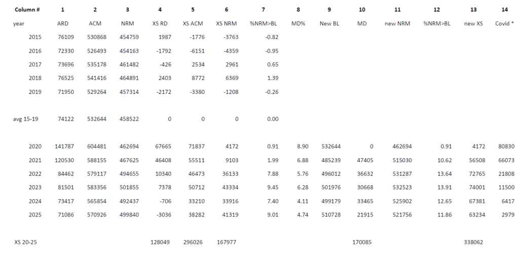
Column 1 shows the total deaths for each year for all respiratory disease (ARD) for the years from 2015 through 2025. Note that this is deaths ‘due to’ respiratory disease as reported weekly by the ONS, as opposed to deaths ‘with’ respiratory disease where the cause of death was something else and respiratory disease was just a comorbidity at the time of death and thus not the direct cause of death. The lower half of the table includes deaths ‘due to’ Covid in ARD as well as all the other respiratory diseases.
It is obvious that, particularly in 2020 but also to a lesser extent in 2021, there were very high numbers of deaths from ARD. Column 4 shows the excess figures relative to the baseline. However the situation was normalising already in 2022 and 2023, and had completely returned to baseline levels again through 2024 and 2025. Bear in mind that several recent studies have appeared that cast doubt on the numbers of deaths ascribed to Covid, particularly in the early phases of the pandemic, so it is possible that the ARD situation normalised even more quickly than appears from the table.
Deaths due to Covid have fallen from a high of over 80,000 in 2020 to just under 3,000 reported in 2025 (out of 71,000 of total ARD), so any artificial inflation of the Covid numbers would now be little noticed in the total figure anyway. Column 14 shows the actual deaths due to Covid in each year just for reference purposes.
Column 2 shows the total deaths for all cause mortality (ACM) for each year. Again 2020 and 2021 were the worst years in this regard, however every year since 2020 also had significantly higher excess death than the pre-Covid baseline (see column 5), and the total cumulative excess since 2019 now stands at just under 300,000.
Column 3 shows the total deaths for non-respiratory mortality (NRM) for each year. This figure encompasses deaths from all other causes than respiratory disease, so it is calculated by subtracting column 1 from column 2. The figure for 2020 is within normal baseline values, and although in 2021 it does rise slightly, it is not until 2022 and each subsequent year thereafter where we can see the significant and sustained rise in the level of this figure over baseline. Columns 6 and 7 show the excess over baseline expressed in absolute numbers and as a percentage respectively.
We can hypothesise from these NRM numbers that there must be some factor operating throughout the whole period from 2022 through 2025, other than Covid itself (which was falling rapidly over that time), which is contributing to an ongoing excess NRM year on year. We may have our suspicions as to the nature of that factor, but the lack of an excess in 2021 weakens the hypothesis.
So this brings me to the invisible factor, which explains the reason why we only can see the tip of the NRM excess death iceberg in 2021, but then do notice it increasing significantly from 2022 onwards. For this factor to become more visible though, we need to rely on modelling.
Now I am as sceptical about modelling as any Daily Sceptic reader, but nonetheless models have been used to justify all kinds of non-medical interventions applied during the pandemic, including the necessity for extreme measures taken on individual citizens, such as the Covid vaccine mandates and travel restrictions, so it should be fair game to make use of models that argue against the narrative. Besides which, this is a very simple model that simply aims to take into account the impact of high mortality years on subsequent years.
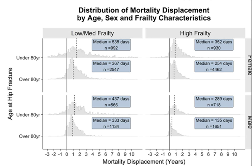
This article discusses the phenomenon of mortality displacement (MD), which was to be expected in 2021 following the high levels of excess mortality in 2020. The authors use a model to calculate MD, which has been derived from following a selected subgroup of actual vulnerable people across a given time period, and then applying the model across the general population.
What we learn from this article about periods of excess mortality is that there is a displacement across time for the recorded excess deaths, and that this is most visible in short term statistics when the excess mortality has largely happened to the most vulnerable sections of society, whose deaths would most likely have occurred in the near future anyway.
In other words, a period of excess mortality amongst the most vulnerable portion of a population will be rapidly followed by a period of reduced mortality in that population, which ought to show up in the mortality statistics a relatively short time afterwards.
We know that the average age of death during the Covid waves was over 80. This elderly cohort already has a heavy weighting in mortality statistics, accounting for more than 80% of the all-cause mortality during normal years. It is no surprise then, that the study calculated a high MD factor (8.9%) for the following year or so as a result of the excess deaths from the first two deadliest Covid waves. This result is in agreement with the earlier study that I commented on back in 2022.
Although the new paper describes its model as a “counterfactual approach”, mortality displacement is directly observable in statistics and is a very real phenomenon. The issue however with the non-respiratory mortality figures in 2021 is that even though the first few months do show a negative excess NRM as predicted by MD, this then rapidly goes into reverse around May, such that the cumulative amount of excess NRM ends the year as a positive figure.
We can surmise then that something else must begin to operate during 2021 to again begin to increase excess NRM to the extent that it eventually outweighs the negative effects on NRM of the MD from the 2020 Covid shocks. Looking at figure 6 in the study paper it can be seen that almost 90% of the MD effects on statistics for the vulnerable cohort studied would be completed and thus visible in the data, within one year from the time of any given spike in death rates.
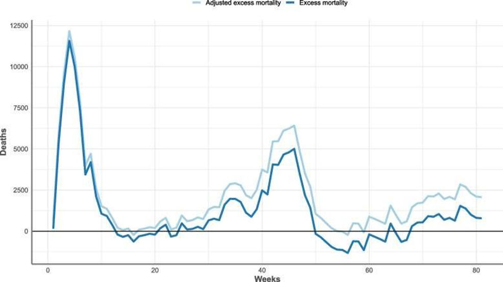
Looking at figure 8 in the study paper we can see graphically how this plays out during 2021 (starts just before week 40), with the gap between recorded excess mortality and adjusted excess mortality gradually increasing over the course of 2021, up until October 8th.
Fundamentally then, in order to get an accurate picture of excess mortality after a recent spike in death rates, one has to add the appropriate figures for MD onto the officially reported figures for total annual deaths. This is achieved by lowering the expected deaths baseline figure for ACM and is eloquently referred to as “harvesting” in the paper’s abstract.
Column 8 shows the calculated MD percentage for the year, which is based on the excess death figure for the preceding year. Column 9 shows the lowered expected deaths from the 2015-2019 baseline as a result of the MD from the previous year. For the purposes of this piece I have ignored any MD operating beyond one year from the excess deaths accumulated during the previous year. Column 10 shows how this translates to the additional MD excess deaths for the year in question, and Column 11 represents the new adjusted NRM total after the MD excess has been added in. Column 12 then shows the percentage increase on the 2015-2019 baseline figure. Finally column 13 shows the adjusted NRM excess numbers for that year.
The reason that I have added the MD onto the NRM figure, rather than the ACM figure, is simply because all the excess deaths that the MD represents are a statement about what didn’t happen but could have happened – the counterfactual. They are deaths pulled forward from the future and all of them will be non-respiratory because they would have occurred due to the poor health of the individuals concerned, which made them vulnerable to dying in the near future from the long term morbidities that they were carrying at the time of the Covid shock.
The authors of the paper on the MD model write that “their general approach can be applied to any adverse event-based outcome (death being just one example) that follows any ‘at-risk’ defining event (here it just happens to be developing COVID-19), to investigate impacts by time or by cause”.
I hypothesise then, that some other factor than Covid has caused a new wave of excess death in the population, albeit temporally more spread out than from the spikes from the obvious at-risk defining event caused by Covid itself. After the adjustments made in accordance with the MD model, the picture suddenly becomes much clearer with respect to when this new traumatic factor began to operate – namely from 2021 and every year thereafter.
It is likely however that the MD figures derived from using the model are an underestimate for 2021, and an overestimate for the following years. This is because, as previously mentioned, a portion of the MD for 2020 will not appear in the statistics until 2022, whereas for subsequent years the MD factor will definitely be less than the 8.9% calculated from the excess deaths that happened suddenly during 2020. This is because the excesses from 2022 and onwards are no longer concentrated in the most vulnerable cohorts where MD effects are visible shortly after their deaths (and thus are caused by something else than what happened in 2020), so the MD effects will be spread out over several more years. A recent post from Dr Clare Craig illustrates the point that excess death after 2021 is no longer restricted to the most vulnerable cohorts.
Furthermore, I have used the ratio of ACM excess from the years after 2020 to the ACM 2020 excess as a proxy adjustment to the 8.9% ACM baseline adjustment figure, and this will be less accurate than the calculations made in the model from the very specific concentrated excess deaths arising from the 2020 Covid spikes that they used.
It may be argued though that an ever-increasing population size from 2020 through to the present could account for many of these excess deaths, and thus using a 2015-2019 baseline annual mortality rate can no longer be applicable. However a brief look at net migration figures show that there were no substantial increases in net migration until the mid-90s (see the first interactive chart shown on this ONS page).
These younger people will have very little impact on ACM for many years to come. The reason is that, just like in many other kinds of statistical data, there is an 80-20 rule operating. That is to say that 80% of deaths are found amongst just 20% of the population, which unsurprisingly is the older subset, comprising those aged between 70 and 95 years of age.
The vast majority (92%) of all non-UK born residents had not yet reached this death zone (DZ) in terms of their age because new net migration is overwhelmingly composed of waves of younger individuals hoping for a better economic future in the UK. The 2015-2019 baseline already includes mortality data from the bulk of more longer term foreign born residents, and their aging over 2020-2025 is not a significant factor in overall mortality terms due to their position on the death rate curve well before the DZ, where the rate changes rapidly (see figure 9 from the ONS 2021 population census).
Meanwhile when one looks at the UK population who are currently in the DZ, it is possible to estimate the relative sizes of the five-year cohorts within it by looking back at the historical birth records.
Plotting these against a standardised ‘deaths by year of age’ graph, it can be seen that in 2020 a peak of births in the cohort born after WW2 (those born between 1946-1950) had already entered into the death zone. Fast forward to 2025 and the subsequent five-year cohort born between 1951-1956 had entered the DZ over the intervening five years. This cohort was smaller than the previous one.
Looking at the other end of the DZ, the very oldest cohort born between 1921 and 1925 exited the DZ over the next five years, to be followed by the cohort born between 1926 and 1930, which was a considerably smaller cohort. The DZ is marked with blue arrows in both charts.
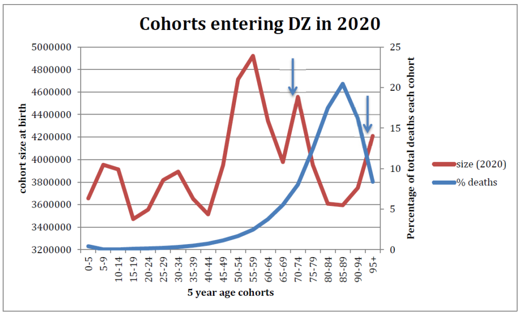
Furthermore if one looks at actual death rates for each five-year cohort and plots this against the years of birth of each cohort, it can be seen that the cohort most affected by the very highest death rates (cohorts to the right of the red line) is of course the oldest cohort. As the 1921-1925 cohort dwindles rapidly to nothing after it moves beyond the DZ, the 1926 to 1930 cohort that replaces it will experience far fewer deaths overall just because it is so much smaller.
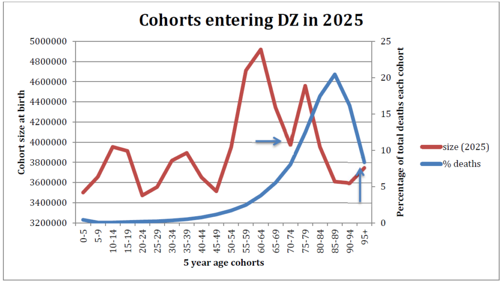
In terms of total numbers, there were 235,000 fewer people in the DZ in 2025 (according to birth cohort ratios), when compared to 2020 (–1%), and also fewer of them were at the oldest ages with the highest death rates. This all points to a falling number of expected deaths from 2020 through 2025, rather than an increasing number.
In conclusion then, I believe that the baseline mortality used to calculate excess deaths in 2020 (the 2015-2019 average) is still a valid baseline for use up to and including 2025. When this is used there has been excess all-cause mortality in every year from 2020 through to 2025, totalling almost 300,000 people. Of note, the EU is still using the 2016-2019 baseline when compiling its mortality statistics. RD has normalised to the 2015-2019 average over this period, which further validates the usage of the 2015-2019 baseline. Nearly all the excess mortality is therefore now concentrated in the non-respiratory mortality.
When mortality displacement is also taken into account – as it ought to be, because the number of expected deaths should have been below the baseline figure in all years after 2020 – then the excess death count is in reality higher still, to the tune of a further 170,000 excess deaths thus far since 2021, so around 470,000 deaths. This is of course a very crude estimation and a more sophisticated study would no doubt whittle this figure significantly downwards. But it will still amount to a considerably larger figure than current official statistics show for excess deaths over the period.
It should be remembered, though, that every excess death represents a mortality displacement to some future year when the death would have otherwise been expected to occur. As younger cohorts now appear to be experiencing increasing death rates in proportion to all other age cohorts from 2021 onwards, much of this younger cohort displacement will be many years from now, and cannot therefore be counted in the figures for 2020-2025 which I am presenting here. But the baseline of expected deaths ought to be reduced for many years going forward in order to accurately gauge future excess deaths.
As Covid is a negligible factor in overall mortality statistics now, something else has caused these excess deaths. Furthermore, whatever it is appears to still be working its insidious effects as we begin 2026. The only way to describe such a situation is carnage on a scale that would be considered unacceptable even in a war situation. It is quite extraordinary that this matter has not been properly investigated by the UK authorities, who seem neither to notice nor to care.
To join in with the discussion please make a donation to The Daily Sceptic.
Profanity and abuse will be removed and may lead to a permanent ban.
I think we all know what the reason is for excess deaths.
I have listed this here before but I have been compiling all the scientific papers (many peer reviewed), studies and articles showing the harms of the Covid jabs.
I have been updating it on a daily basis and it has now climbed to 142.
https://classicrecords1.wixsite.com/the-sceptic/post/covid-vaccine-harms-list-of-studies-and-scientific-papers-and-articles
Well done.
From the papers you have looked at, is it shown that AZ was mainly causing bleeding/clotting issues and that the modRNA products cause a much wider range of issues, led by inflammation and effects on the immune system as primary drivers?
AZ was so bad they had to discontinue it.
All the others also caused problems including many deaths and cancers.
Some batches were worse than others, some were probably just placebos.
Those that had the jabs were playing Russian roulette with their immediate and future health and lives.
I believe the quality control of production is so bad that some batches are like a placebo with virtually no acitve ingredients while other batches are supercharged.
As you seem to be a source of covid knowledge I wonder if you have ever come across a list of the illnesses the joys of the mRNA vax can bring? I ask because I saw such a list running to over 300 that brought a whole range of things I had never heard of. On a basic level both pericarditus and myocarditus were new to me. I knew about Bell’s Palsy but Guillan Barre Syndrome was a new one. I really wish I had kept a copy as a neighbour went down with motor neurone disease and was gone in little over a year. And somebody else was diagnosed with Behcet’s Disease. In both cases you have to wonder what was behind it.
A 38-page report from the FDA in March 2022 features an appendix with a list that says Pfizer’s COVID vaccine has 1,291 side effects.
There is a link to the PDF report listing all 1,291 at the end of the report in Appendix 1 page 30-38 in alphabetical order here……
https://lorphicweb.com/pfizer-covid-vaccine-has-1291-side-effects-reveals-official-documents/
Thanks. It confirms that Behcet’s Syndrome is on the list and although a quick look there seems to be a good chance that Motor Neurone Disease components are there too.
By SHEER COINCIDENCE, funeral advertisements now saturate the TV commercials, where before Covid vaccine rollout, they were nowhere to be seen.
I don’t remember seeing adverts for funerals ever in my life, anywhere, let alone on TV. Funerals were always regarded as something very private, sensitive, and best left to when they became a family necessity; then they were handled quietly & discreetly by your local funeral director.
Now the ads have reached the levels of an epidemic in themselves.
I don’t watch television but am very interested to read what you say.
Is this just GB News, which is my only source of TV news, or does it extend to other channels?
I am speculating that GB News has a higher age profile than other channels and is a prime target for advertisers of both funerals as well as mobility aids.
Other channels and Facebook but then again, I am entering twilight years and they know my age.
GB News watcher here too but yes, it is all over channels as well.
On the subject of adverts, perhaps it is time for some commentary on what seems to me to be a massive increase in government adverts. Some are propaganda such as for buying battery cars or for making your home cosy – stop laughing – with a heat pump. But there have been ads for parole officers, prison officers with it seems female officers in a male prison and the latest last night was for early years teachers. Anyone else spotted them?
Too right! I thought it was just me overreacting! And life insurance for younger people in case of early death.
Anyone would think it was being expected.
Disgusting ambulance chasing.
Just how much has the British governing class gained from reduced OAP, NHS and othyer costs and how much extra have they gained from IHT. The figures would be startling if published.
Ditto other nations (probably not the USA where tax payer largesse is not so much and death taxes are less a thing).
I suspect little too technical for many. Could one not reconstruct an excess mortality graph from say 2010?
I seem to remember the ONS produced a weekly graph with this type of information (maybe not going back that far). They pulled it when it became too uncomfortable as the excess deaths from 2020 weren’t returning to normal levels.
It is possible they didn’t wanted to provide ammunition to many ‘vaccine’ sceptics (aka realists).
A little too technical, perhaps, but Daily Sceptic is nothing if it doesn’t resist a race to the bottom.
An uptick for this, but I have to admit to giving up halfway through the article
Same here I’m afraid. Now if it was little things been grown in jars and jokes about no call for buckets, I’d read all the way through.
Agreed on too technical. Daily Sceptic reported early on in the “pandemic” that no matter how many facts and figures you came up with, if the opposition is reacting on an emotional level (e.g. save granny), then you’ll not be heard. Not that in-depth articles aren’t needed but they also need to be backed up with summaries for the sound bite generation. Sure, we shouldn’t be encouraging that but equally it can’t be ignored.
I’ve never understood “excess mortality”.
All cause mortality (ACM) per capita will fluctuate. I think the year of the “pandemic” that the author refers to was the worst year for ACM since the carnage of 2008, or was it 2009. I am sure since it was so terrible, we would all remember. What are the figures now compared to 2008?
Lockdowns and the “vaccines” were probably bad for “public health” but I am done worrying about “public health” and I don’t want anyone else worrying about it either. I am in the Canary Islands right now surrounded by broken down fat people on mobility scooters drinking themselves to death. I helped a bloke up the stairs with his suitcase today – he was about to collapse/fall down the stairs. Not much older than me. Should I be worrying about that? No thanks (though I was more than happy to help). If any of them asked me, I’d advise a slight course correction, but since they are not asking, I am doing me and am happy for them to do them.
More data…
https://www.midwesterndoctor.com/p/dissecting-the-religion-of-vaccines
Is there a marked increase in any particular causes of death since 2021?
Stroke and cardiac arrest I believe
Plus cancers and the latest iteration – turbo cancer.
A friend of mine is on the way out with pancreatic, turbo variety. Two others of my acquaintance recent cancer diagnoses.
Lost a friend two years ago – turbo.
But none of them will say they were murdered with poisons against a non-existing ‘virus’.
They will all repeat, ‘…it would have been so much worse….’
Critical thinking is not the friend of 80% of the sheeple herd.
Sudden and unexpected?
I recommend https://nomisweb.co.uk
Pick ‘Query data’
Then ‘Life Events’
Then ‘Mortality statistics – underlying cause, sex and age’
You can then filter by country, date, age group, sex and causes of death and report numbers of deaths, or various rates (deaths/population).
Data us available for 2013-2024. Data for 2025 will probably be released in Sep/Oct 2026.
Death rates per head of population obviously rely on ONS’s population estimates. If you don’t believe those numbers then the rate data is more-or-less useless.
Causes of death are available either as full ICD-10 classifications or as summarised into 47 (I think) ‘Leading Cause’ groups. LC01 = Accident to LC47 = Covid. The LC codes do not encompass all causes so you would always have to calculate ‘Other’ as the total numbers of deaths less those attributed to one of the LC causes.
You can then produce charts such as:
or
should that float your boat.
As you can tell I made that first chart with data up to 2022 there’s another two years available so I’ll have to do some updates.
LC01 = Accidents
LC02 = Cancer (malignant neoplasms)
LC12 = Cerebrovascular diseases
LS16 = Cirrhosis and other diseases of liver
LC30 = Ischaemic heart diseases
LC41 = Suicide and injury/poisoning of undetermined intent
In older age groups LC18 = Dementia and Alzheimer disease and LC42 = Symptoms, signs and ill-defined conditions (which encompasses old age) make more significant bands.
“…first two
most deadlyleast unremarkable Covid waves…”Yeah, that didn’t encourage me to carry on reading.
Do we know how many of the deaths had the failed injections?, and let us not forget our sainted NHS is still promoting the shot. I guess its one way to reduce the waiting lists
I’m guessing that the FOI request that was denied by the high court was attempting to answer that?
Amyloid Fibrin Microclots? https://x.com/janjekielek/status/2021632326631821421?s=46
Deaths SOLELY down to Covid – Feb 202 to Dec 2021
Minimal, under 7000almost all over the age of 50
This thought crossed my mind when it said 80,000 excess deaths all due to COVID in 2020. From memory, I thought excess deaths rose from about 55k to 80k. Was every excess death in 2020 attributed to COVID??
The Coronavirus Act 2020 changed the regulations around death registration to make it quicker and easier and require less face-to-face discussion.
If a doctor who had not even ‘attended’ the deceased thought it might be a Covid death then that was pretty much good enough.
ONS Covid death statistics can’t be relied upon. Deaths caused by other factors were routinely classified as COVID to increase numbers and frighten the public. Same for the manipulated PCR tests geared for positive results. Many thousands were also killed in care settings using Midazolam and Morphine and then recorded as COVID deaths. The Covid injections then killed many more. We are living through the biggest medical scandal in history.
I can explain what many of these premature deaths are due to, at least in my (‘deprived’) area of the country. I have looked after many people like this, and reviewed thousands of deaths. Many people, particularly of lower socioeconomic status, have become ‘deconditioned’. Basically, they are unfit, malnourished, inactive and become frail and dependent decades before actual diseases like cardiovascular or respiratory disease is the functional limitation. I wouldn’t get too hung up on a category of death like respiratory disease. This comes from coders having to put a binary code on the complex picture of human illness and frailty. Many people die of pneumonia, it’s just the final process, rather than the cause. My feeling is this has come about due to complex social/societal factors, including generous welfare support, carers allowance, taxis and home deliveries bringing what you want directly to your door, plus people just losing the joy of life since lockdown.
I admit to being not clever enough to follow the full article, however as they say statistics, statistics damn statistics etc… Being one of the boomer generation I’m interested in the ages of the excess deaths. Is it the end of the boomer generation which to me would make sense.
However on a personal note I do believe the ‘jabs’ were not equal. I had no reaction whatsoever but my other half suffered a reaction within days, and eventually died from a very rare form of T Cell Hodgkins Lymphoma after never recovering from the ‘jabs’.
The medics are a closed shop and said nothing.
Oh, the Uk health authority notices….and know exactly what is causing an increase in mortality. A child could tell you. But sadly, your own experts will not.
Thank you for this analysis. Yes it is technical, but it doesn’t hurt to give the grey matter a little exercise. The potential numbers of excess deaths since 2020 is rather war like and this likely to be because it was. Trump initiated Operation WarpSpeed when he started lockdowns in the US. Everywhere that went into this madness changed from dealing with covid as a health issue into dealing with it as a military issue. Here in the U.K. I think the operations were Rescript and Broadshare. If I remember rightly, just before the Emergency Use Authorisation shots were issued in this country, Health England became U.K. Health and Security Agency. So is it that we are still on a military footing rather than Health with our medical services? Although it was replaced last year, my reading of the Integrated Operating Concept was that the U.K. military were on an offensive footing and that home and its citizens were no longer considered safe and so could be targets for action. Trump’s actions abroad are not so surprising when you consider he attacked his own country in his first term, and our politicians allowed this attack on its own citizens. A… Read more »
Unprecedented Persistence of Vaccine mRNA, Plasmid DNA, Spike Protein, and Genomic Dysregulation Over 3.5 Years Post-COVID-19 mRNA Vaccination
https://x.com/freewch/status/2022626986473009365?s=46.
When AI leads to Universal Basic Income it will cost less at this rate.
https://x.com/anish_koka/status/2022724267373212018?s=46
” The COVID response was a symptom of replacing the culture of questioning in science and medicine with a culture of authority
It didn’t matter what was actually true… what mattered was whether you were aligned with authority. ”
– Jay Bhattacharya, NIH Director.